
WordPress Homepage Setup Tips

This article is not about the technicalities or “how to” use WordPress to set up your homepage design. Instead, we will cover what should be on your homepage and why—the things I see that many do not consider, but need to.
All too often, website owners want to have everything possible displayed on the homepage. There are two things to consider with this train of thought:
- Not everyone will discover your site or enter it through your homepage.
- While it is your website, your homepage should focus primarily on user intent.
Why target user intent?
Intent means “resolved or determined to do something.” User intent is the goal or intention a website visitor has when landing on your site. We want to cater to that intent because that naturally leads to conversions.
The same goes for entering a search term into a search engine. What does that searcher want to accomplish? What is their intent?
Google has been concentrating on this for some time now, referred to as page experience. Google makes this part of the search algorithm.
Remember that user intent can be informational, transactional, or navigational. For example, are they looking for information or want to purchase your products? The answer to this question will impact how you set up your homepage — and navigation.
Catering to user intent naturally affects the overall page experience. You want visitors to quickly find what they are looking for and accomplish why they sought you out.
That entails everything from menus to headlines and graphics, all designed to allow your potential customers to accomplish their desires quickly. Keep it short, sweet and at a glance.
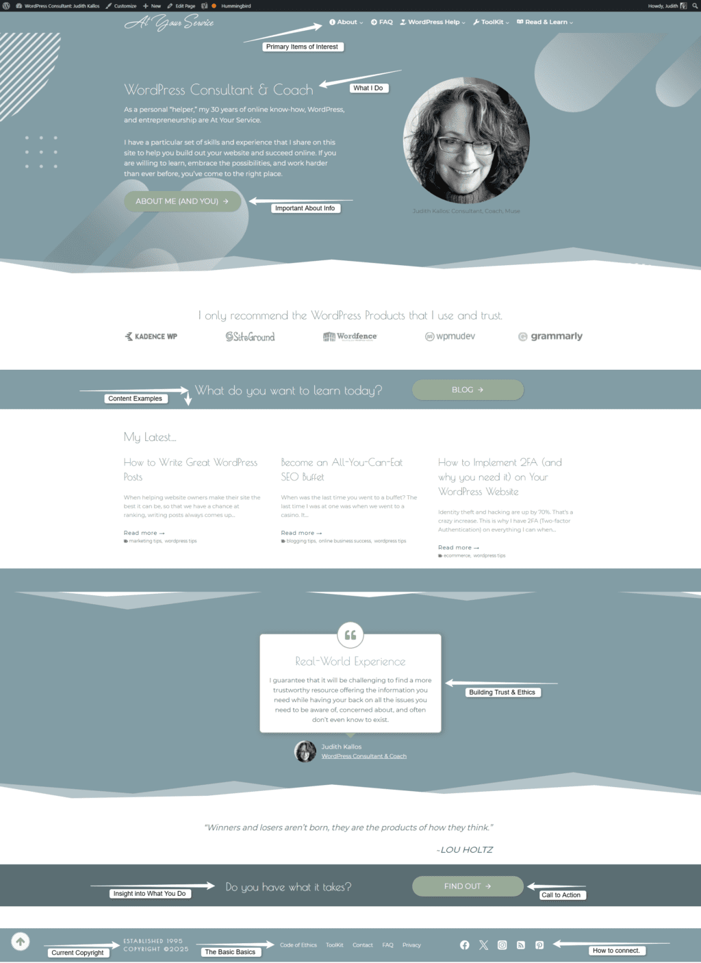
Here’s how we do that. I modified my Homepage to reflect what I know those looking for what I have to offer want to know most. Remember that you can’t, nor should you try, to put everything on the homepage.
Instead, your homepage should be a succinct guide to what is within. My traffic stats pointed me in the right direction and I made my current homepage shorter and more concentrated.
Navigation
Your navigation is just not about menus. It includes how you layout widgets, content, and images to help visitors navigate your website through your homepage.
You first want to concentrate on your homepage’s “above the fold” area. Above the fold is the web page real estate that visitors will see without having to scroll, and it is where you need to make an impact that clarifies the benefit of staying.
Your visuals and any content or headlines must let the site visitor know they’ve landed at the right place for what they are looking for and what you have to offer. You should know this by looking at your stats and logs to see what visitors gravitate to.
If you have a new site, put on your customer hat and think about what you would look for if you landed on your website. In other words, prioritize what a customer would want versus what you want them to know. Many times, those are two different sets of information.
Website Menu Considerations
Next come your menus. All too often, folks want overly complicated menus that include everything on the site. Resist that urge.
Instead, choose the handful of information that is most sought-after and funnel visitors to those areas. Customers expect to see your About, Contact, Services/Products, and FAQ pages to start. Then, add only what you know will benefit your site visitors’ primary intent.
For example, visitors want to know where your shop page is so they can see what you offer. That means you link to your shop from menus and your hero image above the fold.
Next, they may want to know about shipping, lead times, and policies impacting their next move. Enter your FAQ (Frequently Asked Questions) page.
Regarding drop-down menus, a couple here or there, if intuitive and only if it makes sense. Such as shipping, returns, and policies under your Products/Shop menu link. But here again, we don’t want to have an arm’s length of menus that lead to submenus that lead to submenus.
Instead, consider having custom menus in your sidebar on the pages where they make the most sense or apply to the content on that page. You want to guide your visitors to the information or next step based on where they land and their intent.
Another option is to have all those ancillary informative pages in your footer widget menus. Visitors are accustomed to looking for all that standard and customary site and company data there.
Content
We don’t want a homepage that scrolls on forever and ever, especially with unnecessary blah, blah, blah. Stick with a page and a half at most. Your homepage should be a quick guide to the rest of your website. Again, you want to prioritize what your due diligence reflects customers seek out the most.
Include your most viewed information. Information that your customers ask you about. We want to focus on why that visitor landed on your homepage and what they are most likely looking for. Provide that.
Images
Your visuals need to be on point. You want images that load fast because they are optimized, the right size for the space, and applicable to that specific content.
Every quality WordPress theme advises what size images should be used for various areas. Use that exact size and orientation—do not deviate. Following those guidelines will contribute to the professional appearance you saw in the theme demo, which is most likely why you chose that theme.
Image sizes are one of the top offenders in slowing down website performance. In my experience, it is common to see website owners uploading images that are thousands of pixels in size larger than needed to display on the site. However, rarely should the image be larger than 1200-1800 pixels in width (and that’s for the top of page and hero images only).
Slow websites impact customer experience and your rankings. So, find those sizes and upload images only in those exact sizes. The service I use that covers all this with templates and more is Canva*.
Call to Action
Your CTA allows you to recommend (or coerce) site visitors into taking action. Subscribing, ordering, reaching out — whatever you want them to do, your CTA accomplishes this.
Having a CTA on your homepage makes sense. But having another CTA in the same spot (footer widget or sidebar) throughout your site is not a bad idea so visitors know where to find it when they are ready to order, subscribe, or make contact.
Footer Widgets
Just as with your top-of-page menu, where visitors have certain expectations of what should be included, this applies to your footer widgets, too. Most themes give the option of 3 or more areas to provide the info visitors expect to find at the bottom of website pages:
If your theme does not include footer widgets, that’s fine. Instead, have a navigation menu reflecting the primary info pages folks want to review before doing business with you.
This includes minimally your FAQ, Contact, Privacy, and Policy pages.
Security
While all quality WordPress web hosts offer free SSL (HTTPS vs. HTTP), I still encounter many WordPress websites that are HTTP. What does that do for user intent? It scares them away from your website. What would you do if you landed on a website’s homepage and saw this?

The above displays and entirely blocks your homepage — or any page on your website. If you don’t have SSL, move to a host that installs, maintains renewals, and offers SSL certificates at no additional charge. SSL is now an included standard and customary service that website hosts provide.
Special Mention: Color Scheme
Colors are subjective. Others may not like colors that I like. But the fact is that colors have meaning and evoke specific responses and emotions, even if subconsciously.
Most people I know, myself included, are not very creative, so creating a professional color palette to represent your brand is a benefit. You then have that handful of color codes to use in everything you do, including offline marketing collateral. This approach also contributes to visually building your brand.
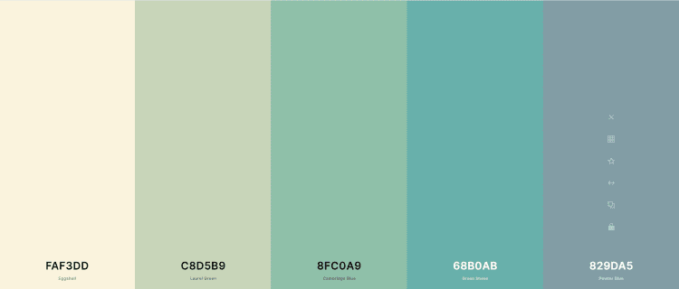
Consider creating your unique color palette. Use your logo colors as a starting point.
When working on your site, keep your color palette front and center. If your theme allows you to set your colors in Appearance > Customize, you can integrate them there.
The key is to be consistent, using the same handful of colors, a.k.a. your palette, in everything you do, online and offline, on your site and social media. This helps build your brand to be visually recognizable at a glance.
Here are a few sites where you can check out to create your color palette for your WordPress website:
Visually Appealing, Quick and Intuitive
First impressions will make or break you.
When it comes to your WordPress website’s homepage, you want to create a stellar first impression—one that speaks to your site visitors and draws them into your little world on the web. You want to minimize the gap between intention and action.
This requires a contemporary professional presentation that loads quickly and addresses site visitors’ needs. Striking the right balance may take time and tweaks, but you’ll know when you do. The inquiries and orders will speak for themselves.
At your service,

*Some of the links on this page are to companies with which I have a professional affiliation.
Read my complete affiliate statement here.